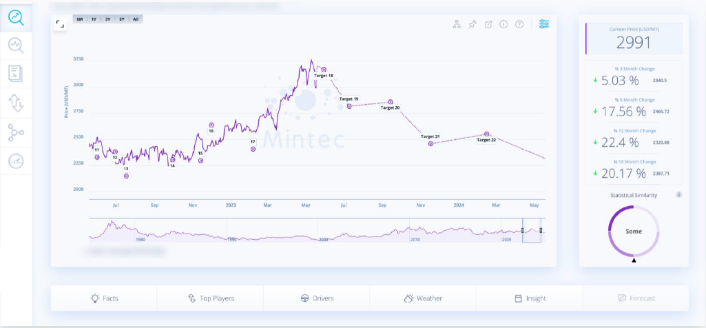
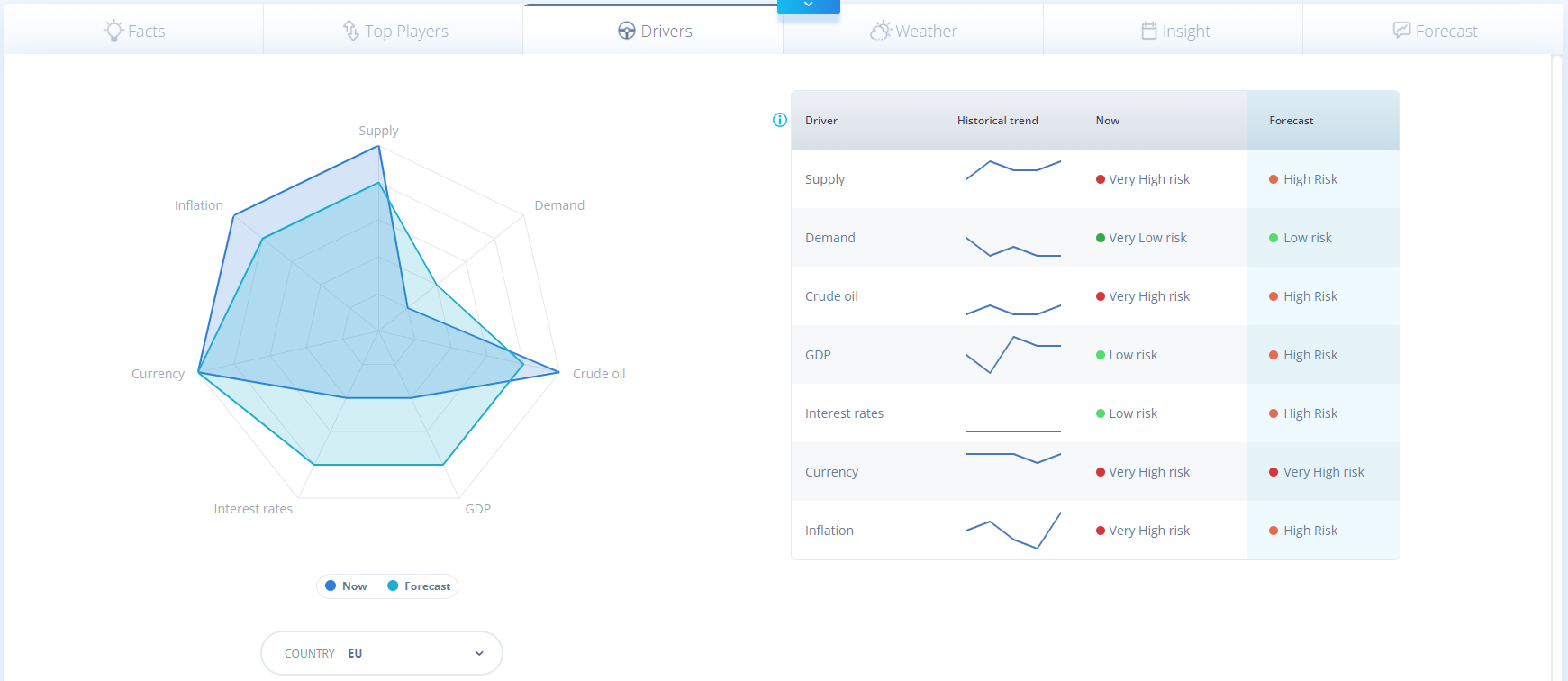
You can look at the Statistical Similarity score which is alongside the Algo Forecast chart, to the right hand side:
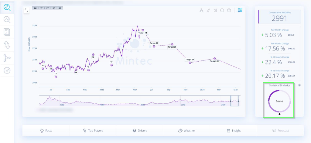
Statistical Similarity scores explained:
0-40: Low similarity between the algorithmically forecasted series and its parent forecast, with several periods where they deviate from each other. Algorithmic forecasts should not be expected to be as accurate as those with higher similarities.
40-60: Some similarity between the algorithmically forecasted series and its parent forecast, but with extended periods where they deviate from each other. Algorithmic forecasts should not be expected to be as accurate as those with higher similarities.
60-80: High similarity between the algorithmically forecasted series and its parent forecast, but with some period where they deviate from each other.
80-100: Very high similarity between the algorithmically forecasted series and its parent forecast, with few or no periods where they deviate from each other.


.png?width=658&height=555&name=Mintec%20Dashboard%20library%20(search).png)
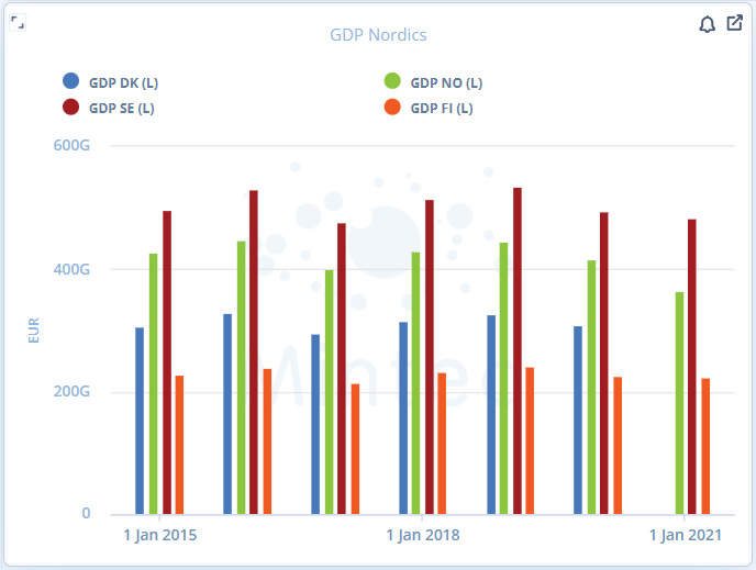
.png?width=1369&height=775&name=Line%20Chart%20widget%20(up%20to%2020%20series%20graphed).png)
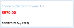
.png?width=137&height=62&name=Information%20Panel%20widget%20type%20(selection).png)

.png?width=647&height=620&name=Mintec%20Models%20library%20(search).png)